

Streamlining the onboarding investor journey
A UX Design company project for FinTech, Creativemass.
PROJECT OVERVIEW
The brief: To review the current customer journey for onboarding on Creativemass’s financial services portal.
The set up: A three week design sprint (while working on other projects), working autonomously with regular check in meetings for feedback from other designers on the team.
The process: User research through to website design, including synthesis and iteration.
Key tools: Adobe XD
Key methods:
● Competitor and comparator analysis.
● Business analysis.
● User interviews/testing.
● UI Design.
● Journey mapping and secondary research.
My role: Owned all deliverables, presentations and communication with the team. Led all user research, synthesis, design and final recommendations.
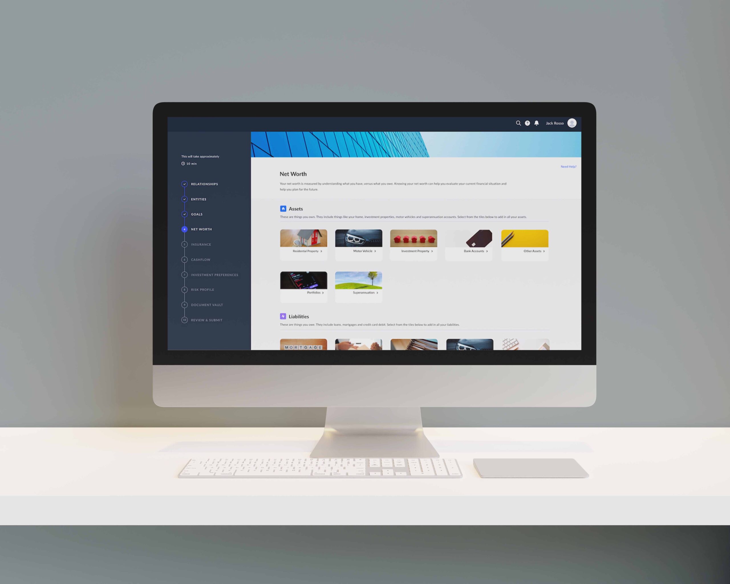
The problem: Onboarding was a long process, manual onboarding was confusing, user flows were disjointed and and there were inconsistencies in the UI.
The solution: My solutions were to shorten the process for the user, remove manual onboarding as an option and to review the UI style guide.
Delivered: Service and website design recommendations, documentation of the research and synthesis and a 30-minute presentation handing over the final deliverables and recommendations.
*Note: The portal has not yet launched and confidential therefore I have hidden the logos from the mocks ups in this case study.
RESEARCH
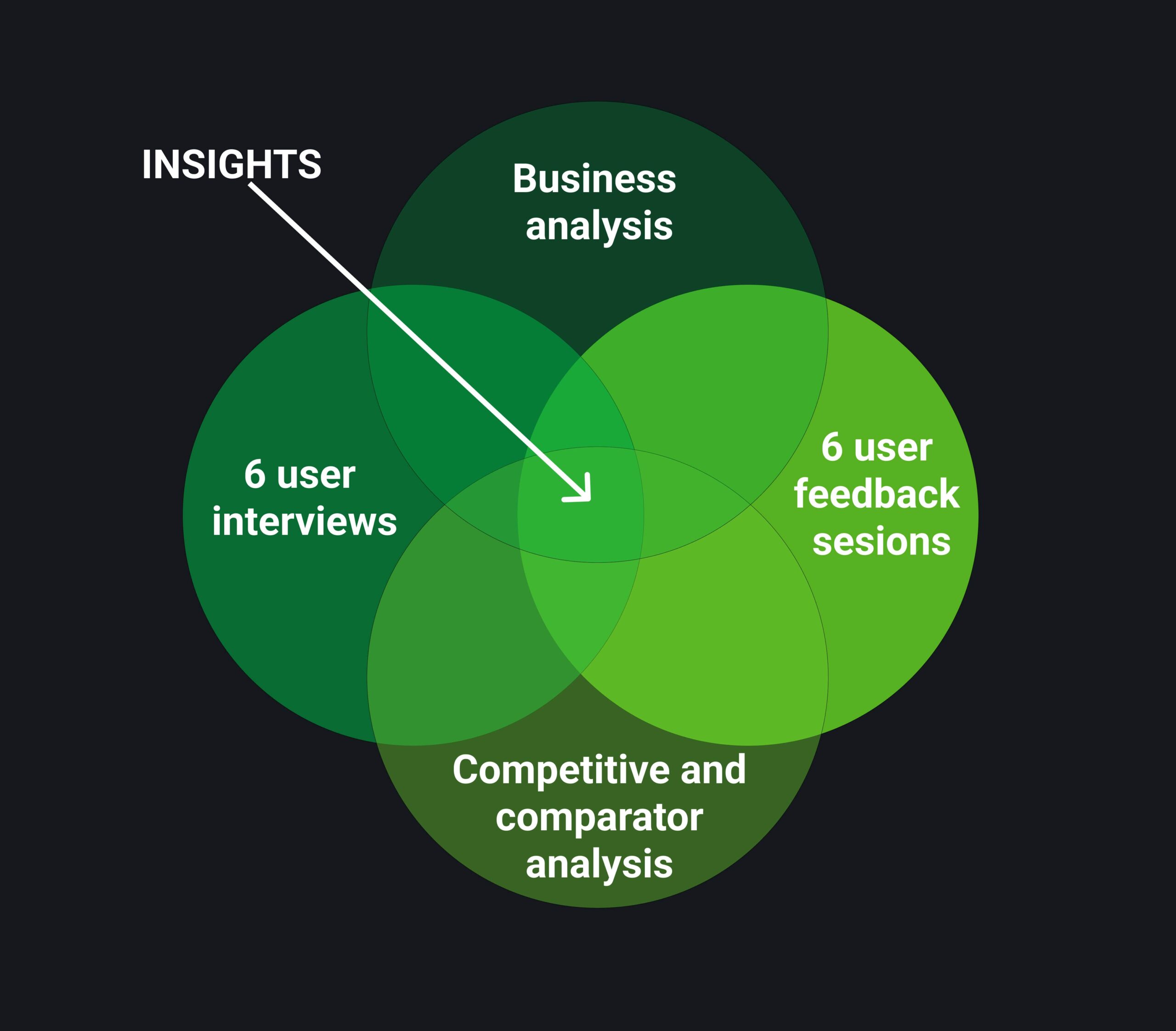
A range of target users were consulted.
Interviews with the portal’s potential investors helped us to understand what users expect from such a service.
● 6 x 60 minute interviews with target users (to learn about their onboarding journey and what their expectations and pain points were along the way).
● 6 x 60 minute user feedback sessions with target users (to learn specifically about their manual vs wizard, carousel/vs no carousel, larger vs smaller sizing of tiles, left hand nav and text and the review and submit user experience.
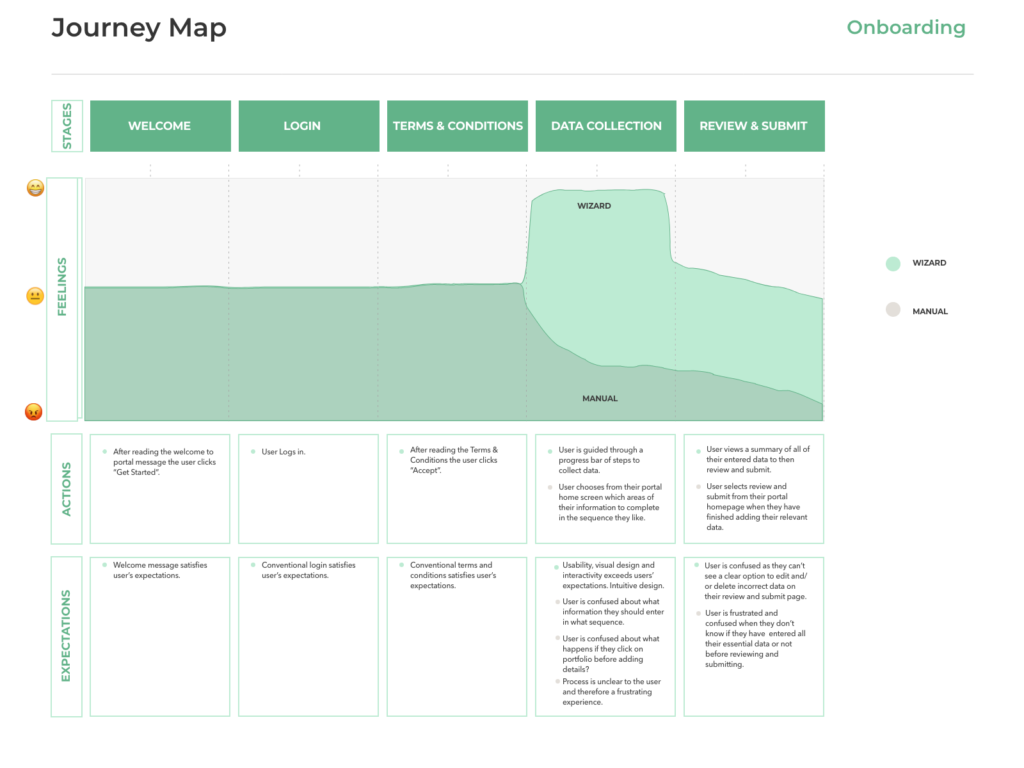
Customer Journey Mapping.
This helped us further understand the customer’s pain points and experiences at each stage in the journey (wizard and manual). The most significant pain points were in the manual onboarding experience.
These were the findings and opportunities.
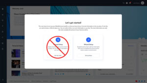
● Most participants were confused with the concept of having 2 setup options for onboarding and felt manual onboarding didn’t make sense.
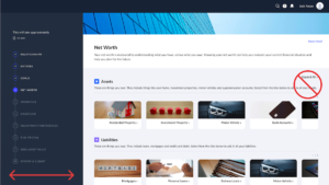
● Most participants thought that having no carousels made more sense to them than carousels as they wanted to see the content and find what they wanted in less clicks.
● Most participants thought that a more narrow left hand navigation made more sense to them the a wider left hand navigation for the best use of screen real estate, neater style, reduced excess white space and showed most important information as priority.
● Most participants said that they would see an advantage to having a download PDF option on the review and submit step in onboarding.
● Most participants said that they would like to see clear options to edit their details on the review and submit page rather than having to click on their details to discover that there is an option to edit.
● Most participants found that the first 2 screens summarising onboarding were overly wordy and overwhelming with the amount of detail.
SOLUTIONS
Recommendations for a better onboarding experience.
● Remove manual onboarding.
● Remove all carousels and reduce size of all selectable tiles so all options are visible on screen for the user.
● Narrow the left hand navigation to be the same size as in the rest of portal.
● Add a download PDF option to the review and submit page.
● Add clickable “edit” text to each line of the details in the review and submit page.
● Summarise the first 2 welcome screens into 1 welcome screen, including only essential information for the user.
Designed, tested and iterated the solutions.
As a result from testing and iterating the solutions my final recommendations were adopted by the team and the designs handed over to the developers to make the updates.
Where to from here.
There are important next steps for the business
● To do a complete UI cleanup to make all pages of on-boarding consistent (including size of body text, headings, buttons and left hand navigation).
● To review all copy as some of the meaning of the copy is unclear (especially the copy used on action buttons).
● To review all icons used throughout onboarding as some of them add no meaning/ have no purpose for the user.
●To continue to review, test and iterate on designs after the MVP launch.
Upon reflection…
We felt confident that my recommendations put us in a good spot to build and launch our MVP product.
Linkedin
Phone
Envelope
VIEW MY OTHER PROJECTS
Copyright © [hfe_current_year] [hfe_site_title]